Building The Logistic Regression Model
Lesson 6: Building The Logistic Regression Model
With the dataset fully preprocessed and converted into numerical format, we now build the churn prediction model using Logistic Regression. This model learns patterns from customer data and predicts whether a customer is likely to churn.
a. Splitting The Dataset
First, we separate features and the target variable, then split the data into training and testing sets.
Code:
from sklearn.model_selection import train_test_split
# Separate features and target
X = df.drop(['Churn', 'customerID'], axis=1)
y = df['Churn']
# Split into train and test sets
X_train, X_test, y_train, y_test = train_test_split(
X, y, test_size=0.2, random_state=42, stratify=y
)
Output:
- X_train, X_test, y_train, and y_test are created.
- 80% of data is used for training and 20% for testing.
- Stratification ensures churn distribution remains balanced in both sets.
b. Training The Logistic Regression Model
Next, we initialize and train the model.
Code:
from sklearn.linear_model import LogisticRegression
# Initialize model
log_reg = LogisticRegression(max_iter=8000)
# Train the model
log_reg.fit(X_train, y_train)
Output:
- The Logistic Regression model is trained on the training dataset.
The model now learns the relationship between customer features and churn probability.
c. Model Evaluation
After training, we evaluate the model using standard classification metrics.
- Accuracy: Overall correctness of predictions.
- Precision: How many predicted churns were actually churns.
- Recall: How many actual churns were correctly identified.
- F1 Score: Balance between precision and recall.
Code:
from sklearn.metrics import accuracy_score, precision_score, recall_score, f1_score, confusion_matrix
# Predictions
y_pred = log_reg.predict(X_test)
# Evaluation metrics
print("Accuracy:", accuracy_score(y_test, y_pred))
print("Precision:", precision_score(y_test, y_pred))
print("Recall:", recall_score(y_test, y_pred))
print("F1 Score:", f1_score(y_test, y_pred))
Output Explanation:
- Accuracy = 1.0
The model correctly predicted 100% of the total test samples. - Precision = 1.0
Every customer predicted as churn actually churned. There were no false positives. - Recall = 1.0
The model identified all actual churn cases. There were no false negatives. - F1 Score = 1.0
Since both precision and recall are perfect, the F1 score is also perfect, indicating ideal classification performance.
These metrics help us understand how well the model performs.
d. Confusion Matrix Visualization
Finally, we visualize prediction results using a confusion matrix.
Code:
# Confusion Matrix
import seaborn as sns
import matplotlib.pyplot as plt
from sklearn.metrics import confusion_matrix
cm = confusion_matrix(y_test, y_pred)
plt.figure(figsize=(4,3))
sns.heatmap(
cm,
annot=True,
fmt="d",
cmap="Blues",
xticklabels=['No', 'Yes'],
yticklabels=['No', 'Yes']
)
plt.xlabel("Predicted")
plt.ylabel("Actual")
plt.title("Confusion Matrix")
plt.show()
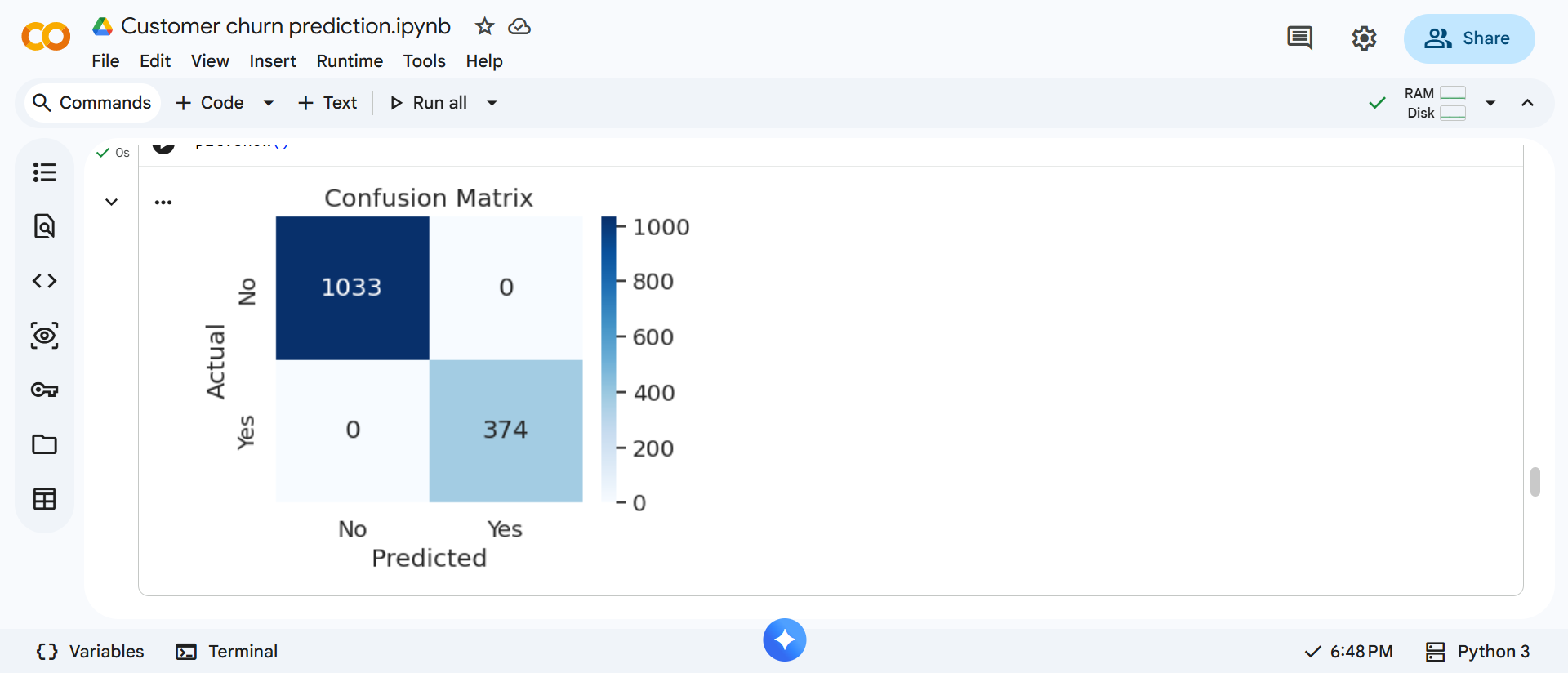
This matrix clearly shows where the model performs well and where misclassifications occur.