Exploratory Data Analysis (EDA)
Lesson 4: Exploratory Data Analysis (EDA)
Exploratory Data Analysis helps us understand patterns, trends, and relationships in the dataset before building a churn prediction model. It reveals which factors influence customer churn and highlights important behavioral signals.
a. Churn Distribution Analysis
We first analyze how many customers churned versus retained.
Code:
import seaborn as sns
# Set style
sns.set(style="whitegrid", palette="muted", font_scale=1.2)
# Distribution of Churn
plt.figure(figsize=(6,4))
sns.countplot(x='Churn', data=df, palette='Set2')
plt.title("Churn Distribution")
plt.show()
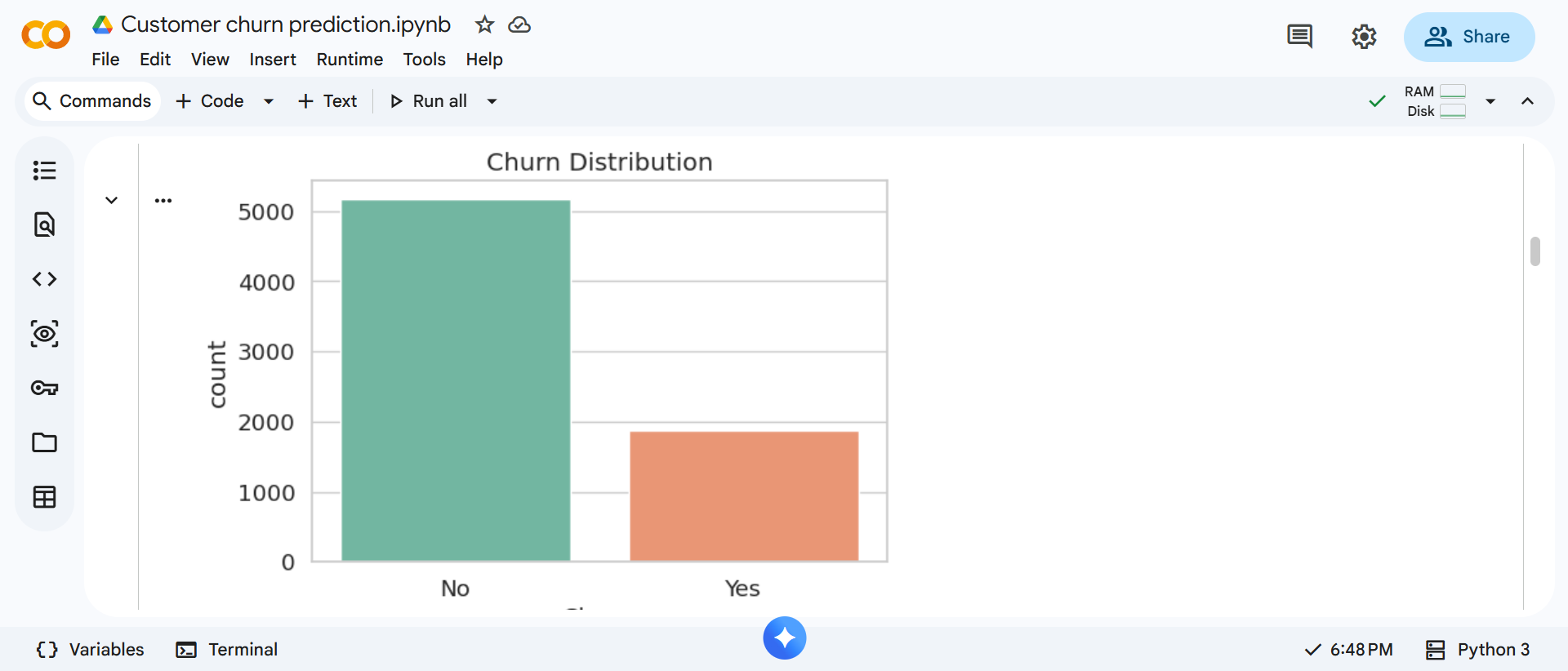
Output: Displays the count of customers who churned and those who stayed.
This helps us understand whether the dataset is balanced or imbalanced, which is important for model performance.
b. Churn By Contract Type
Next, we examine how contract types relate to churn.
Code:
# Churn vs Contract Type
plt.figure(figsize=(6,4))
sns.countplot(x='Contract', hue='Churn', data=df, palette='Set1')
plt.title("Churn by Contract Type")
plt.show()
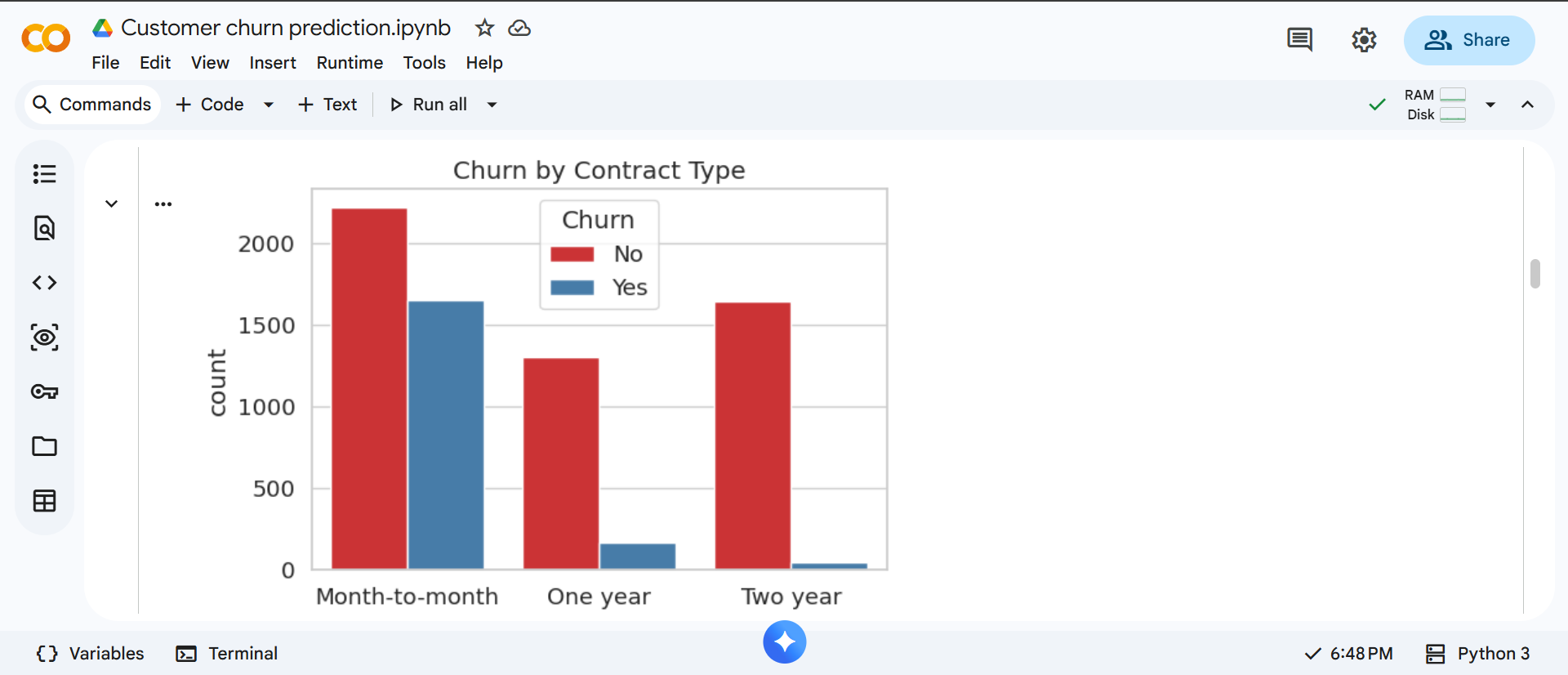
Output: Shows churn distribution across different contract types.
This reveals whether customers with month-to-month contracts churn more frequently than long-term contract users.
c. Churn Vs Payment Method
We analyze whether payment methods influence churn behavior.
Code:
# Churn vs Payment Method
plt.figure(figsize=(6,3))
sns.countplot(x='PaymentMethod', hue='Churn', data=df, palette='Set3')
plt.xticks(rotation=45)
plt.title("Churn by Payment Method")
plt.show()
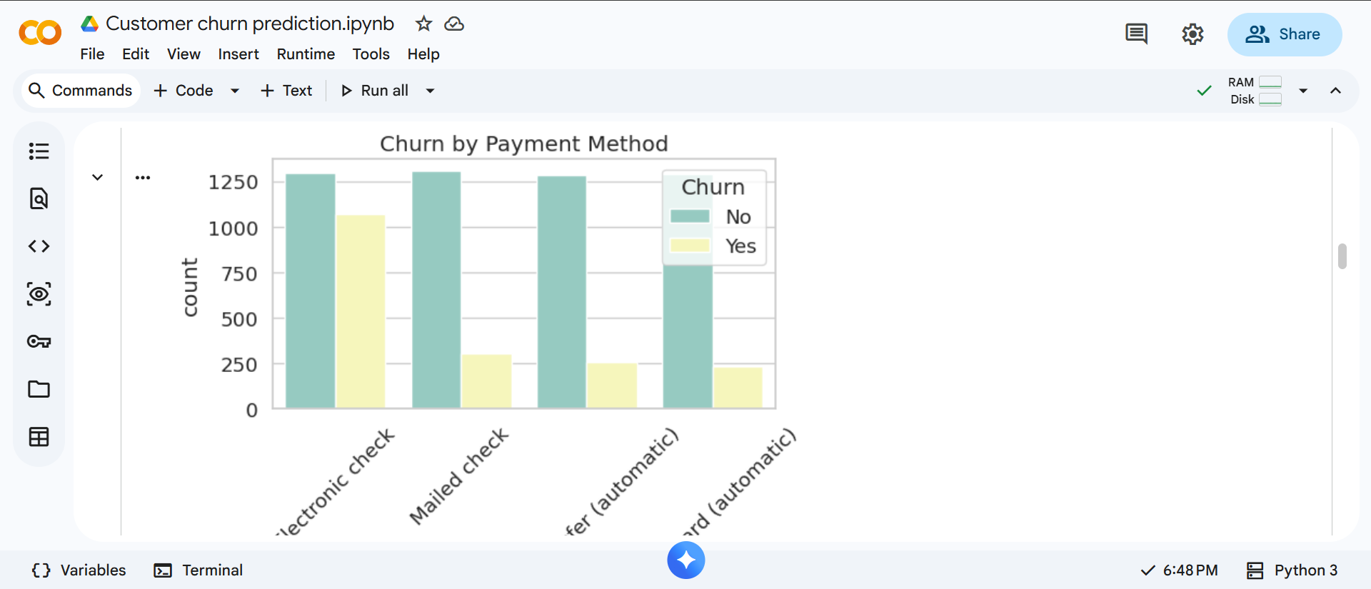
Output: Displays churn counts based on different payment methods.
This helps identify payment patterns linked to higher churn rates.
d. Tenure Distribution
Now, we study how customer tenure relates to churn.
Code:
# Tenure Distribution
plt.figure(figsize=(6,3))
sns.histplot(data=df, x='tenure', hue='Churn', multiple='stack', bins=30, palette='coolwarm')
plt.title("Tenure Distribution by Churn")
plt.show()
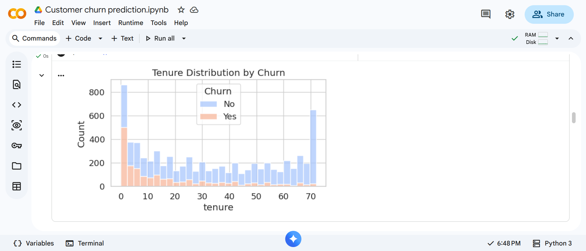
Output: Shows how long customers stayed before churning or continuing.
This helps determine whether new customers are more likely to churn.
e. Monthly Charges Vs Churn
Next, we compare monthly charges with churn behavior.
Code:
# Monthly Charges vs Churn
plt.figure(figsize=(6,3))
sns.boxplot(x='Churn', y='MonthlyCharges', data=df, palette='Set2')
plt.title("Monthly Charges vs Churn")
plt.show()
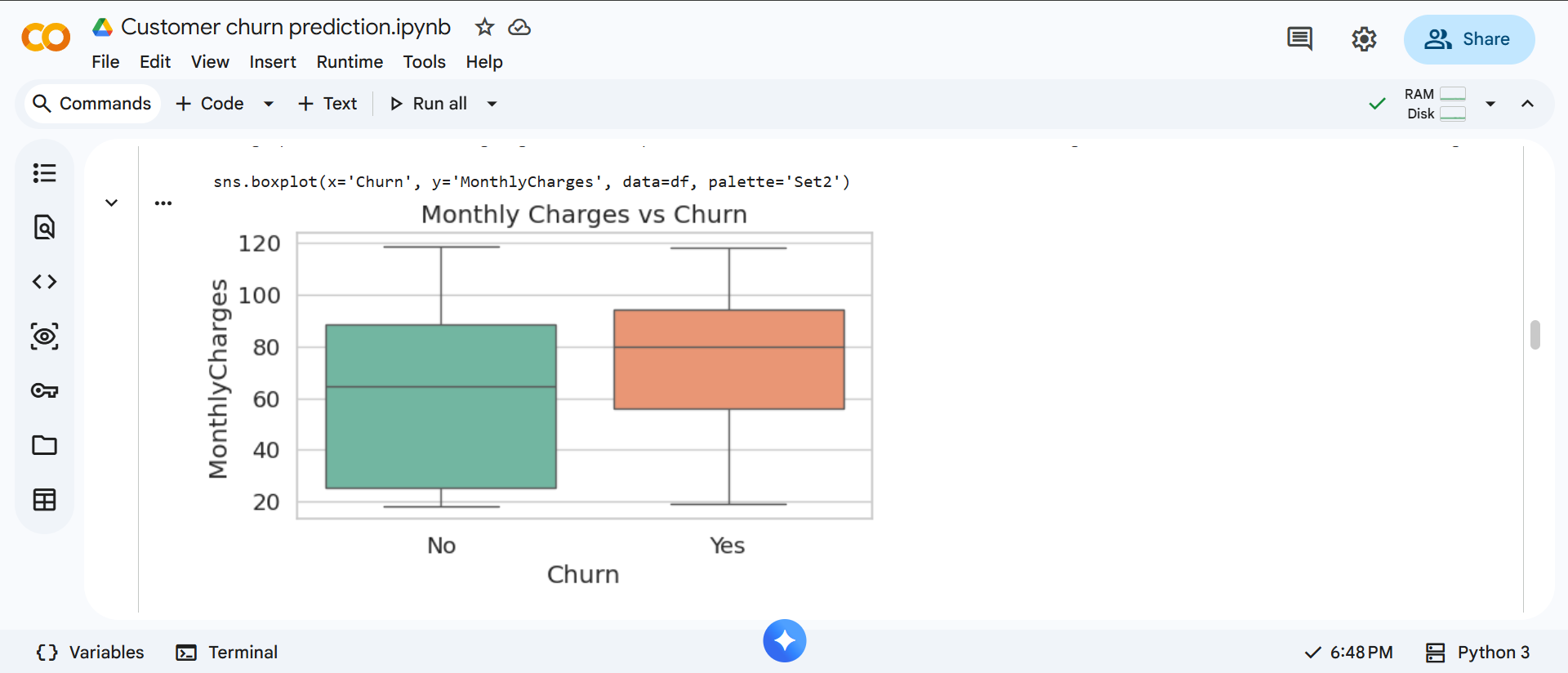
Output: Displays the distribution of monthly charges for churned and retained customers.
This helps identify whether higher charges are associated with increased churn.
f. Correlation Heatmap
Finally, we analyze correlations between numerical features and churn.
Code:
# Convert 'Churn' to numeric for correlation analysis
df['Churn_numeric'] = df['Churn'].apply(lambda x: 1 if x == 'Yes' else 0)
# Select numerical features
numeric_features = ['SeniorCitizen', 'tenure', 'MonthlyCharges']
corr_matrix = df[numeric_features + ['Churn_numeric']].corr()
# Plot heatmap
plt.figure(figsize=(6,3))
sns.heatmap(corr_matrix, annot=True, cmap='coolwarm', fmt=".2f")
plt.title("Correlation Heatmap (Numerical Features vs Churn)")
plt.show()
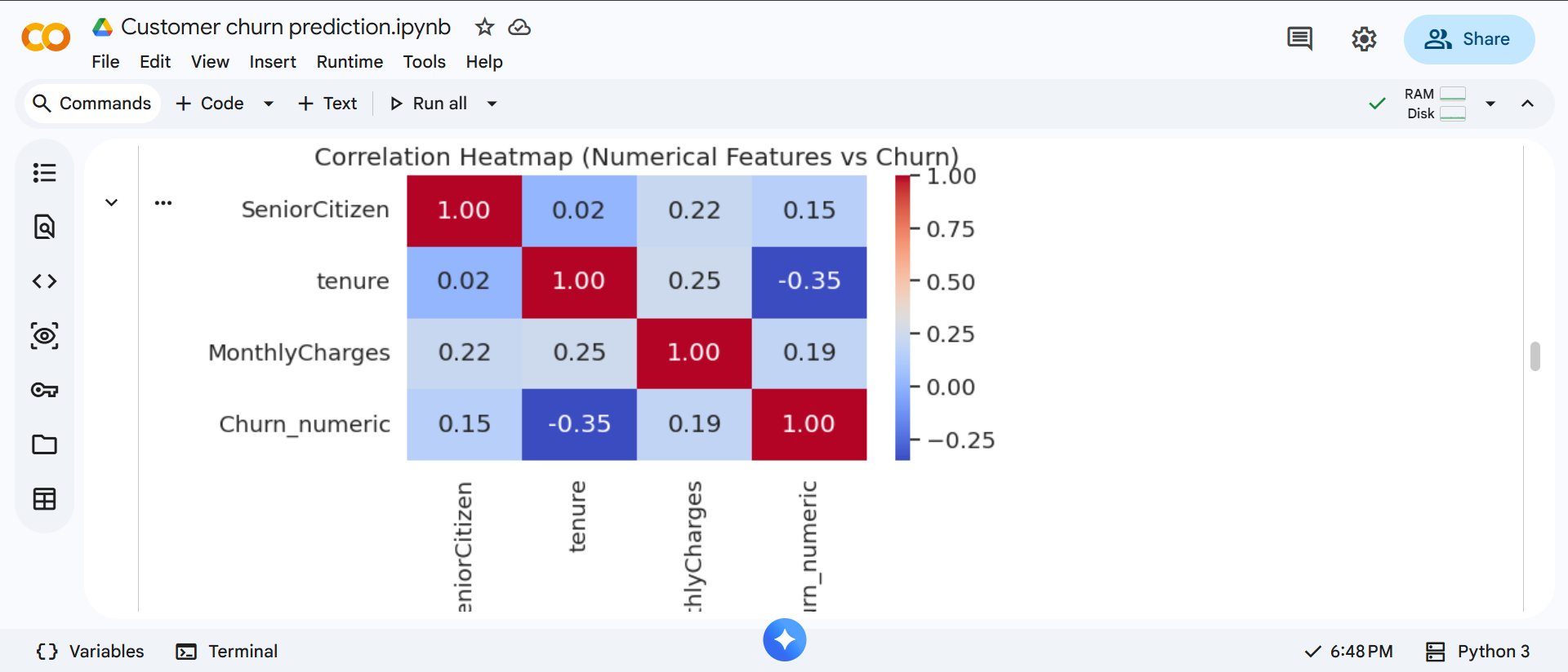
Output: Displays correlation values between numerical features and churn.
This helps identify which variables have stronger relationships with customer churn before model building.